Crunchyroll Brand Evolution 2015-2018
In 2015, when I joined Ellation, the Crunchyroll brand lacked a cohesive approach, having been largely built by its audience. With 650k paid subscribers and poised for growth, it was necessary to define the brand and increase its appeal. To achieve this, I implemented yearly brand design refreshes, allowing for regular analysis and implementation to stay responsive to the growing product.
2016 Everything Anime
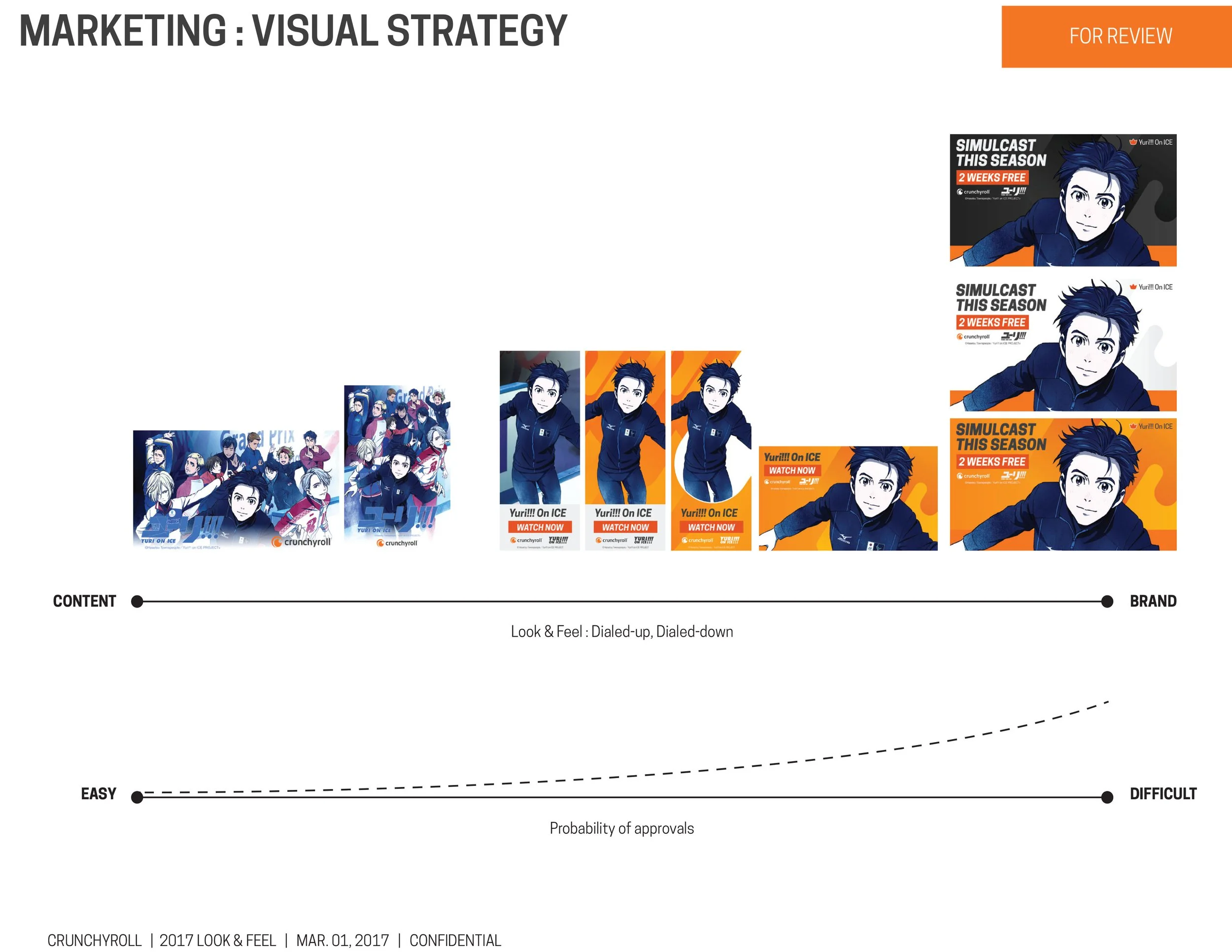
In 2016, we rolled out the first brand refresh, creating a marketing-focused style that could be applied to various applications with few common themes. We aimed for an intense, poppy, punchy, and saturated tonality, experimenting to see what would resonate with our audience.
2016 Video Creative
Concurrent with the work I was doing on our static assets, I also pushed my team to expand our video efforts. We needed video creative that would seem in place with our mainstream competition.
2016 Mini-Campaigns
To address brand tonality, we gave more attention to smaller campaigns and collaborated with e-commerce and content management groups to increase attention on their initiatives.
2017
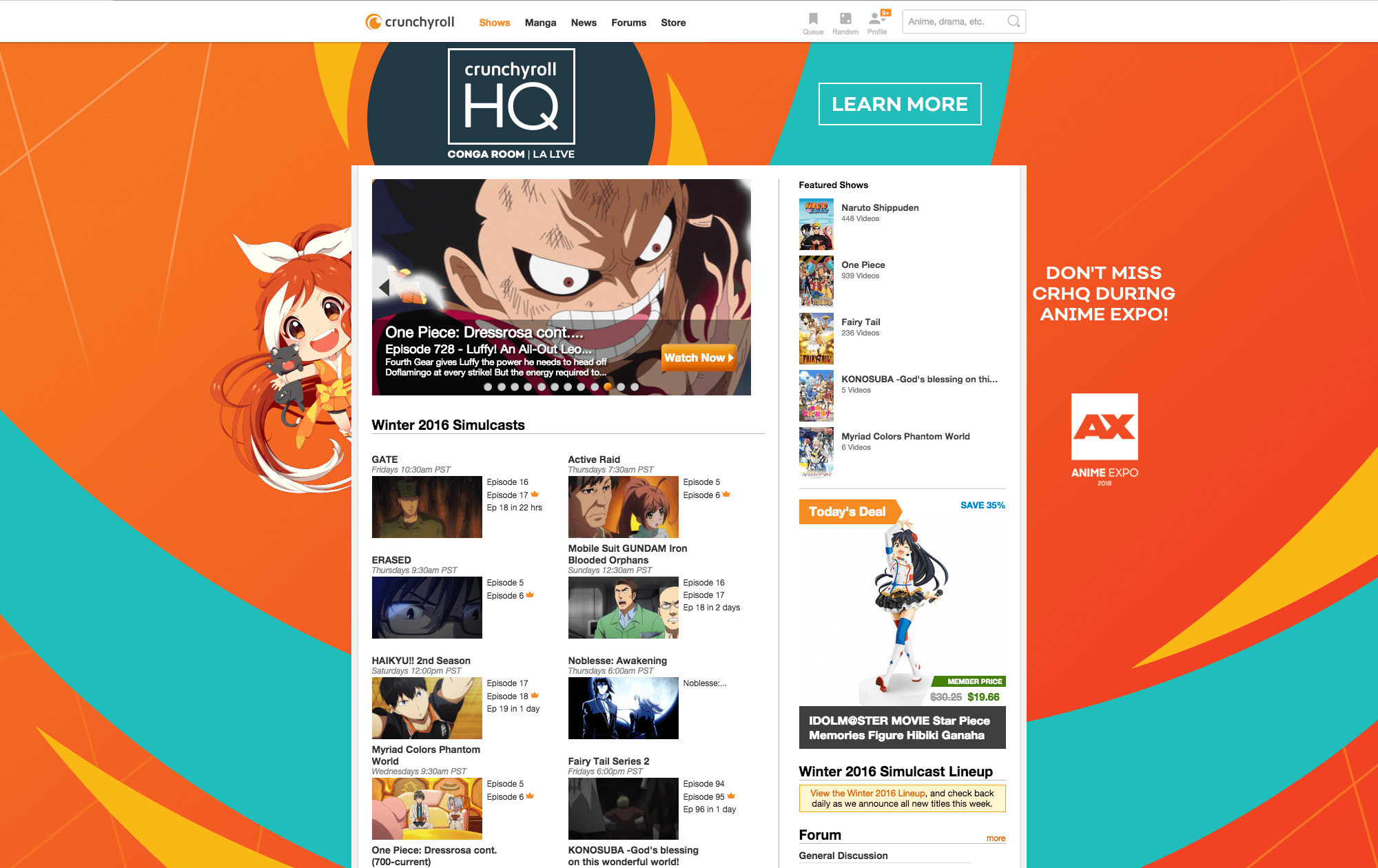
In 2017, we took a more strategic approach to design, focusing on refinement rather than breaking out visually. It was the first year that Crunchyroll's brand design was consistent across all touchpoints, including on and off-channel, social media, events, and out-of-home advertising.
2017 Brand Placements
2017 Video Creative
Crunchyroll Expo 2017
In 2017, Crunchyroll launched its first owned and operated event, Crunchyroll Expo, for which my team provided comprehensive creative support to ensure its success.
2017 Style Guide


2018 Global Brand Refresh
In 2018, we took on a more ambitious redesign for Crunchyroll by modifying the logo and introducing a new color scheme. With 2 million paid subscribers we aimed to give the brand a more mainstream look, and with our substantial international growth, we also delivered the redesign in 8 languages.
Logo Modifications
For 2018 we decided to simplify the main logomark. Previously it had a been a two-tone logo, which creates difficulty in implementation, in order to streamline the brand, we changed to a monotone logo.

Old Logo

New Logo
New Colors, New Fonts, New Shapes
Beyond the logo, we also modified the brand palette and introduced a new geometric vocabulary.


2018 Brand Placements
2018 Video Creative
Crunchyroll Anime Awards 2018
Anime Expo Crunchyroll HQ


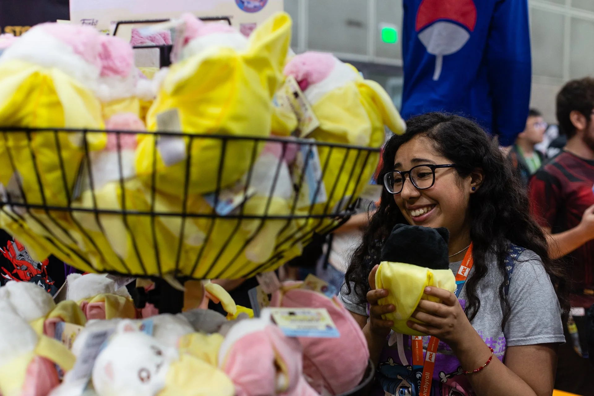

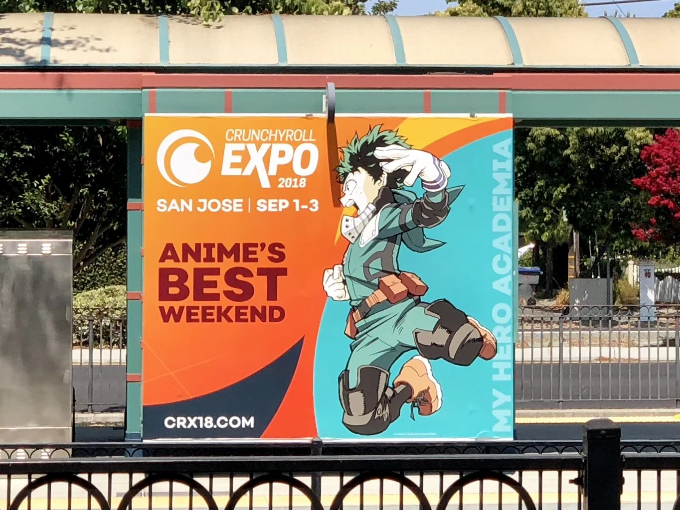
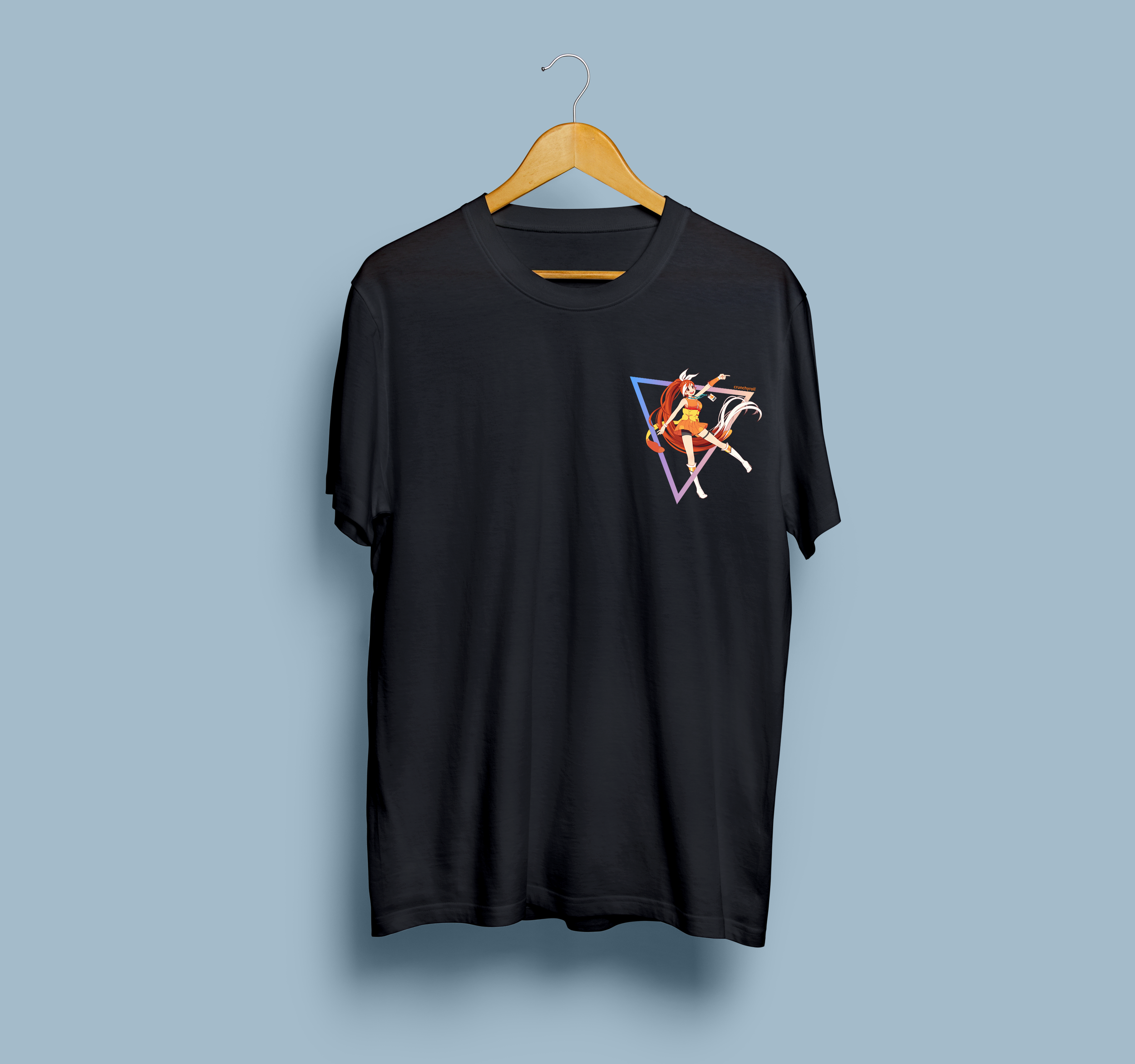
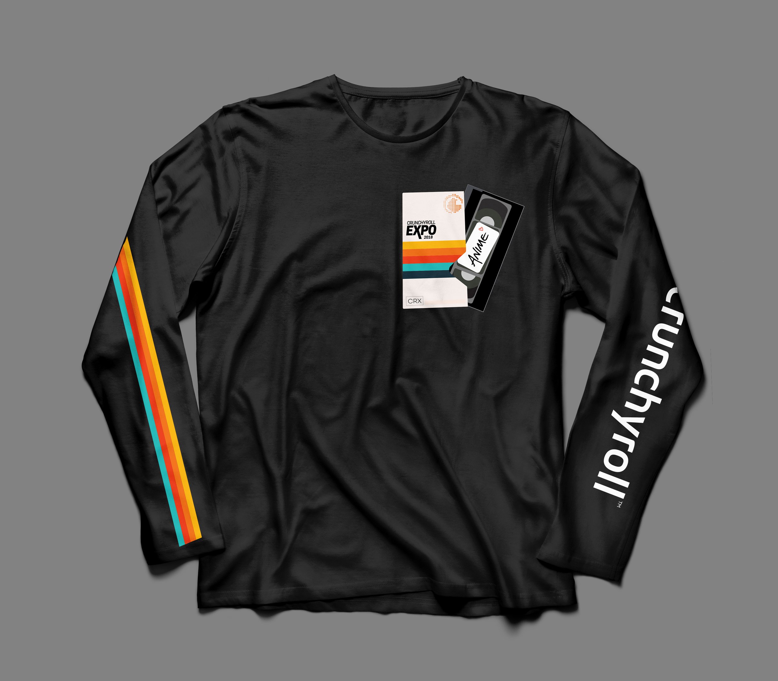
Crunchyroll Expo 2018
2018 was the second year for our owned and operated convention - Crunchyroll Expo. My team branded the event and supplied all the collateral - digital marketing, video, out-of-home, merchandise designs, microsite, etc. We even wrapped the entire front facade of the San Jose Convention Center!